Welcome to the social design: loose lessons from the stylized representation of the social in cinema and print. A blog very often about the interior design, fashion, social manners, and music created for and reflected in vintage cinema and print. Especially from the Sixties and Seventies, especially Italian, and especially from swingin' party scenes. We're awfully big on disco hippies and the OpArt accent here. Guaranteed, of course, to wander off on the occasional tangent into (maybe?) related subject matter, with plenty of tongue-in-cheek commentary for your consideration along the way. Comments are welcome, so please consider yourself invited...


Friday, February 18, 2011

SWINGIN' SPY PAD FROM "MODESTY BLAISE" (1966)


#15: PLEASE DON'T DECORATE WITH DOLLS.

This isn't a party scene but of course the scene of many parties.  Another interesting clip from 1966's spy flick Modesty Blaise, though not nearly as whole-heartedly endorsed as the last. I won't lie, I have a love/hate relationship with this interior. Some of it is so great, and some of it is so rotten. So which to consider first?

OK, let's start with rotten since we all know there's energy in the rotten. Here goes then: What is with those goddamned dolls?  Yes, they're kind of interesting in and of themselves, with their attenuated posture, their dressy clothes and sexy hair.  But as part of an interior scheme? Ick! Gag! Puke! Decorative accents they do not make. It's best to avoid toys in general, unless it's a nursery of course, but dolls are the worst. At the very best you'll achieve "mildly creepy", and at worst: tacky, cutesy, or very creepy. Dolls are a lot like drug paraphernalia, they should be kept in a box and pulled out only as needed.

And now something great: how about a modular sunken conversation pit ... wrapped around an open fireplace ... and adjacent to an enormous and very well-stocked bar? How about it! One has to love the spatial planning here. What a play pen. I'm also very keen on the practicality of the enveloping, pull-around draperies - since a pad like this might easily swing past the break of dawn and then it's always better to pretend otherwise. But I can take or leave the textile choice.

Shagadelic white flokati rugs and a sea of throw pillows seem almost de rigueur, but again the textile choices for the pillows are questionable. Maybe it's the unimaginative, matchy-matchy-with-the-draperies thing, maybe it's the use of dull, blunt solids, which seems by today's eyes a bit of a cop out, but this textile story is definitely lending an airport hotel vibe. 

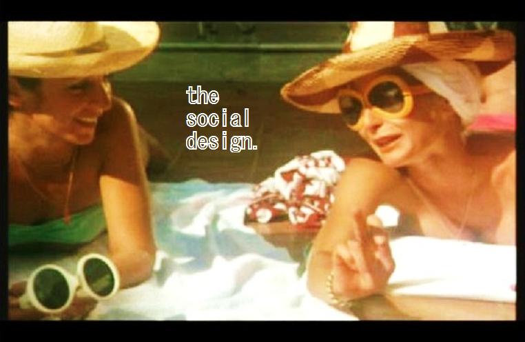
All of that said, though, of course what this interior really needs the most are some happening, turned-on people really making this spy pad swing, baby!


Wednesday, February 16, 2011

OP ART VILLA FROM "MODESTY BLAISE" (1966)


#14: SOMETIMES FRANKLY MORE IS MORE.

Those of you who have followed from the start might recall the post from January 11, 2011 - and the very first of the design principles thus far posted - #1:  USE GRAPHIC OP-ART PRINTS TO ENLIVEN AND CONTEMPORIZE AN INTERIOR, EVEN IF YOU HAVE TO WEAR THEM YOURSELF. It's no secret I think Op Art accents are the deal, really my kind of chic. 

So the other night I'm sitting around watching films with Babydoll and Mr. Arge, as often we do, and at some point into 1966's Modesty Blaise we come across this scene: a peek inside the villa of the criminal mastermind Gabriel (played by the silver-wigged Dirk Bogarde). I almost passed out, these wall treatments are so hot! 

I mean, really, why just accent with Op Art when you can full-tilt marinate in it? 

I'll also applaud the designer's use of color, which keeps it very seaside fresh and I suspect also softens down the optical effect to something easier to live with, otherwise very intense in high-contrast black and white...


Movement in Squares by Bridget Riley, 1961


Do check out this excellent Brittish website (http://www.op-art.co.uk/) for more information on Op Art and the artists instrumental in its development, like Bridget Riley and Victor Vasarely, as well as contemporaries.  Plus the Sound Matrix under the "Music" section is worth tripping out on for at least twenty minutes.


Friday, February 4, 2011

BODYPAINTING SCENE FROM "BLACK EMANUELLE 2" (1976)

(WARNING: FABULOUS NUDITY!)


#13: BODYPAINTS - A YES!

From the 1976 film "Black Emanuelle 2" (Emanuelle nera No. 2), directed by Bitto Albertini.

OK, so maybe the date is a little late. And two nympho patients in a sanitorium hardly a discotheque make. But the groovy soundtrack and the unbridled freedom of nude bodypainting say just one thing to me: another deliriously delicious case of Disco Hippie-ism! In this scene Shulamith Lasri (acting under the name Sharon Lesley) plays Black Emanuelle. She and fellow clinic patient Danielle Ellison get baked and then freaky with the art therapy. It's awesome to let go of your hang-ups! It's awesome to be saying something one minute and then taking your top off the next! I can't say that bodypaints are chic per se, only that their application stinks of joie de vivre, and that is always in style. Now go paint your tits!


COCKTAIL PARTY SCENE FROM "BLACK EMANUELLE 2" (1976)


#12: IT'S ALL ABOUT THE RED ACCENT PIECE.

From the 1976 film "Black Emanuelle 2" (Emanuelle nera No. 2), directed by Bitto Albertini.

So the first time I saw this scene I thought Dagmar Lassander was the star. She looks fabulous, one has to admit, presiding over cocktails as her psychiatrist husband comes home from a long day of treating Black Emanuelle's apparent mental disorder. What could it be, a case of Acute Nymphomania perhaps? Yeah, whatever the case, I guess I'd have problems too if everyone always prefaced my name with a racial modifier.

But then of course later I realized the real star wasn't actually big, German, Euro-Scream-Queen Dagmar but rather those silver platform shoes on the lady in blue on the sofa. Those sure pair well with booze and cigarettes.  But you know, while they are without question the best fashion accessory in the whole scene, I am finally able to say with certainty that the real star of this scene is...

That red secretary in the background. Eighteenth century-styled, likely English, with lacquered chinoiserie finishing. Red accent pieces to interiors can be like salt to food: when used sparingly they finish off rooms and give interest. This applies with casegoods like the secretary and also chairs, as well. And especially in this film scene, to an otherwise totalizing neutrality I can only describe as "monolithic mushroom".

And yes, to review from previous posts, uniformed domestics are still an attractive (and very functional!) accent. And you'll notice he's wearing red, too.

#2:  ACCESSORIZE WITH A WHITE-GLOVED MANSERVANT WHENEVER POSSIBLE.