Welcome to the social design: loose lessons from the stylized representation of the social in cinema and print. A blog very often about the interior design, fashion, social manners, and music created for and reflected in vintage cinema and print. Especially from the Sixties and Seventies, especially Italian, and especially from swingin' party scenes. We're awfully big on disco hippies and the OpArt accent here. Guaranteed, of course, to wander off on the occasional tangent into (maybe?) related subject matter, with plenty of tongue-in-cheek commentary for your consideration along the way. Comments are welcome, so please consider yourself invited...


Thursday, March 29, 2012

CHARLES AND RAY EAMES' "POWERS OF TEN" (1968/1977)

I pretty much abhor a blog post that starts with "Sorry I haven't been on lately..." and yet here I am practicing what I preach (against).  Well, in my defense, I did start a new job and I'm also in the early throws of a workshop dedicated to prodding its participants into producing a very rough, book-length manuscript in thirty days time. That I can hardly put out a blog entry in thirty days leads me of course to question what I was thinking. But that said, I do have a little something to share today, and hopefully so much more soon enough...

If you are of a certain generation (namely the one called X), which is to say a school kid of the 1970s, then you're probably familiar with this short film.  It's called Powers of Ten and was written and directed by Charles and Ray Eames in 1968, later re-released in 1977.   It's a film adaptation of the book Cosmic View, written by the Dutch educator Kees Boeke in 1957. And I think every American science teacher of the era screened it in their class, too. On a very clunky film projector, I remember quite well.  Now it's handily available for your viewing pleasure online...

So whatever the era and whatever the means, I think the film retains a modernity still today.  It was certainly a mind-opener for the young set back then, equally fascinating now.  Just a little tonic for an increasingly myopic world...


Enjoy!


-a.t.s.

Monday, February 13, 2012

IN PRAISE OF OLD FRENCH COUGARS: JEANNE COLLETIN IN "EMMANUELLE" (1974)

warning: fabulous nudity


Valentine's day is upon us once again, but honestly I've never been a great fan of the holiday's aesthetic.  I think it's kind of tacky - and anyway, at this stage in the game it's my style to stay the bachelor.  So instead of sugar and romance for you, my valentines, this year comes something closer to our own hearts here at the social design ... glamour and bisexuality!  Do relax, though - of course since it's on here it's just the stylized, cinematic representation of such.  For the real thing, you're really going to have to get off the computer.

It's odd to live in a time when one can be nostalgic for simpler, more innocent times - and yet that simplicity and innocence includes vintage European softcore erotic filmmaking.  For you younger readers, there really was a time before the internet and the porn avalanche that came with it.  In the early Eighties, late night cable television piped watered-down erotica into t.v. rooms across suburban America, and back then a little nudity went a long way.  It was light, the televised version of a peek at your dad's Playboys.  Of course there was full-tilt porn in the world, but VHS was just picking up steam, the cost of tapes was astronomical, and otherwise one had to trek to a seedy XXX theater in the inner city to see it on the big screen - none of which was within the realm of possibility for kids that hadn't even gotten their driver's licenses yet. But we were hungry to know the full potential adult life had to offer, and this way one only had to wait for one's parents to go to bed.

Not too long ago we rediscovered a beloved "childhood classic" in the screening room: director Just Jaeckin's seminal Emmanuelle of 1974.  The oddly/aptly-named Jaeckin wasn't the first softcore eroticist by far, but his influence shaped the cinematic landscape of the Seventies.  Creating erotic visual fantasies set against lush, exotic landscapes populated by beautiful people in beautiful clothes, Jaeckin's formula was repeated again and again - in his own projects and sequels as well as the resulting deluge of (often accidentally quite hilarious) knock-offs.  I can't even count how many films the  Italian-produced Black Emanuelle franchise spawned.  These erotic, escapist works of the Seventies made for a bulk of early Eighties late night cable programming - and for a lot of kids of a generation, AIDS had yet to rear its ugly head and the adult life looked awfully fabulous...


Sylvia Kristel and Jeanne Colletin in Emmanuelle. I'm sure sometimes they forget whether
they're taking it off or putting it back on.


The fabulous Jeanne Colletin (1938-2006): French cougar extraordinaire and member of the Comédie-Française.


The story of Emmanuelle revolves around the sexual awakening of a young French woman who's come from Paris to join her husband in a colony of horny ex-pats living in Thailand. The title role is played by Sylvia Kristel, and there is no denying her striking beauty.  It certainly helped her - a Dutch actress who otherwise didn't speak a lick of French -  pull off a feature role in an entirely French-languaged film.  But you know - and maybe it's world weariness, or boredom with the ingenue, or just the knowing, aged-like-fine-wine wisdom of maturity - but on our recent screening we found the character of the old bisexual cougar, Ariane, to be the real star of the show.  Deftly played by Jeanne Colletin, Ariane is aggressive, manipulative, a prowling sexual omnivore. And she's chic, too - even pulling off a turban or two through the course of the film. And let's face it, turbans and ingenues seldom mix...

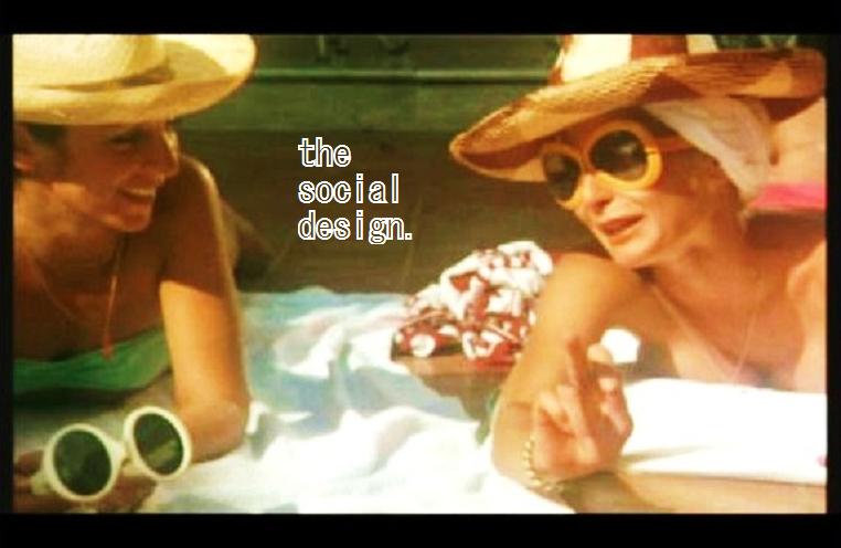
So today it's a sexy, softcore double feature!  In this first scene from the film, we see the recently arrived Emmanuelle's introduction to the other leisure-class wives of the French colony.  There's some terrific vintage poolside-chic here - with the sunglasses, the hats, the Celine scarves - and I love Jaeckin's panning camera in this segment.  But it's also Emmanuelle's (and our) introduction to Ariane as she makes her first play for Emmanuelle's affection.   Note Colletin's excellent use of a shrubbery to enhance her pouncy, cougar-like appeal...


Emmanuelle meets the ladies poolside


She's smooth, that Ariane.  Eventually Emmanuelle and Ariane hookup, and then Emmanuelle has a relationship with Bee, who we see in solitude on the poolside chaise.  Interestingly, upon it's release in 1974 the film was almost universally lauded by lesbians for its sensitive portrayal of female love.  That said, later in the film Ariane gets to breathlessly deliver (perhaps less credible, but awfully amusing) zingers like: When you are young, you make love naturally ... as you eat and breathe. When you are still making love at Mario's age, it's poetry! Oh, those French...

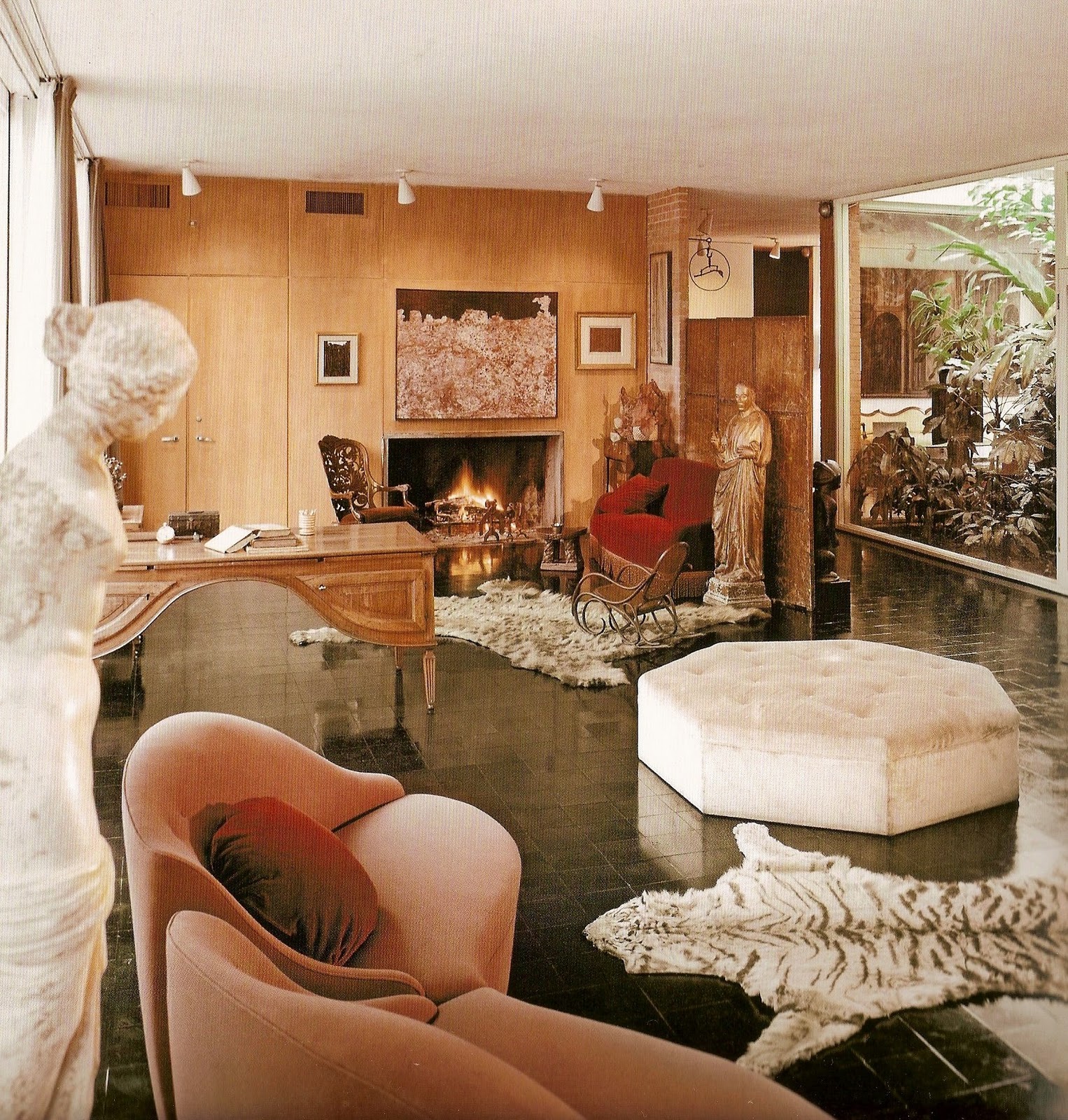
And finally, the best.  My personally favorite scene: Emanuelle has broken the swinging colony's go-lightly rules and emotional fallout ensues.  In this scene the manipulative Ariane seduces Emmanuelle's husband, Jean (played by Daniel Sarky) to unleash himself in an oddly invigorating mixture of lust and contempt.  I think you'll also see that a very strong performance in a supporting role is turned in by the table lamp...


Caught in the cougar's den!


Pretty terrific, n'est-ce pas?  I mean, I hardly know where to begin: the bejeweled evening gown, the "colonial" interior, the lamp, that crazy magazine!  It's interesting - and a real testament to the art  - that for as utterly nasty as the scene comes off, it is really mostly built on a brief instance of frontal nudity and some funky, raunchy music.  Otherwise their obviously simulated lovemaking lasted all of thirty seconds - which frankly is the very opposite of hot.  Well, such was the beauty of the Seventies softcore film:  improbable, abstracted pantomimes of sexuality, brought to life in a lush, sensual world.  The lamp actually got me more excited, but you know I think the two seem to work in mutual dependence...
Enjoy!

-a.t.s.


Saturday, January 28, 2012

NEW DUTCH MASTERS: THE GRAPHIC ART & DESIGN OF MICHIEL SCHUURMAN


REVISIT EXQUISIT, 2010
Commissioned by de Service Garage


So one of the things I love most about the age in which we live is the rapid pace and expansive breadth of discovery that the Internet allows.  It truly is a world-wide web, and it succeeds in widening my own web of consciousness daily.  Today, for instance, I post in praise of a recent "discovery" (and I think for reasons fairly obvious to any regular social design reader): the Dutch graphic artist Michiel Schuurman, whose very groovy, eye-popping posters can often be found ornamenting the Amsterdam cityscape.   

It's no secret we're keen on the graphic zip of an Op-Art accent around here.  In fact, it was my very first post a year ago - one that celebrated the Italian Giallo starlet Rosalba Neri in a particularly arresting black & white number in the film Amuck -  that advised to "USE GRAPHIC OP-ART PRINTS TO ENLIVEN AND CONTEMPORIZE AN INTERIOR, EVEN IF YOU HAVE TO WEAR THEM YOURSELF..."  Well, really, it was good advice then - and by then I mean last year and the Early Seventies - and it's still good advice now. 

Schuurman's work calls into play all the classic, retina-tickling Op-Art tropes - but he very successfully integrates them into compositions that are in result electrifyingly contemporary and, in my esteem, without any particularly detractive sense of the derivative.  Says the artist's website: Schuurman’s personal work specializes in typography and poster design which often boasts a rather maximalistic approach. His practice of combining bright colors, warped glyphs, harsh perspectives, and acidic patterns creates some awfully intriguing eye-candy, which he often screen prints himself. 

Well, needless to say, I think his posters are terrific.  Actually I'd very much like to enliven my own interior space with one - and really, I am very seldomly a framed poster kind of guy, so I hope that the extent of my endorsement of Schuurman's work is fully realized.  But enough of me.  A look at more of the artist's very stylish, very switched-on work...

Enjoy!

-a.t.s.


CURRICULUM VITAE - Written portraits - Louis Behre, 2011
Commissioned by the  De Centrale Bibliotek Den Haag


PS PROJECTSPACE, 2010
Commissioned by Jan van der Ploeg. 
This one was very appealingly hung in multiples, creating a continuous color-stripe effect.


HOFSTEDEROTH17:SOLO, 2011
Commissioned by de Service Garage, an Amsterdam gallery space


QUIET IS THE NEW LOUD, 2011
Self-commissioned


We Need a Whole Lot of Flowers, 2010
Commissioned by de Service Garage


DECODING, 2010
Commissioned for Graphic Design Festival Breda


Some of these editions are still available for purchase.  Michiel Schuurman's website is at www.michielschuurman.com


Thursday, January 12, 2012

THESE CRAZY BOOTS WERE MADE FOR DANCING: "SOLLA SOLLA ENNA PERUMAI" (1981)


Perhaps you've noticed that I sometimes tag posts for a category called "please stop dancing like that".  Videos that feature silly or strange or oddly groovy dancing receive the distinction -  but of course the title is really quite ironic since mostly I just want to see more dancing like that!  Maybe it's time for a change to "oh god, please keep dancing like that"?  Well either way, I'm pleased to say today that I have a fine new addition to the club, and is it groovy!

My friend Eddie shared this video not too long ago - after hearing the music on the radio and then spending considerable time first trying to figure out exactly how it all might be spelled and then where it might be found.  The beautiful, more-than-asked-for reward for such tenacious dedication to the absurd is this YouTube video : "Solla Solla Enna Perumai".  I haven't the faintest idea what that means or what it's about, but I do know it's a hoot-and-a-half to watch.  Not only do you get a groovy soundtrack and kooky floor show, but then everything breaks out into slapstick hilarity!

You'll notice there's a little English thrown into the script - mostly ornamental - but the predominant tongue is Tamil.  Apparently akin to the Hindi-based Bollywood film industry, there is also in India a Tamil-based Kollywood, based out of Kodambakkam in the southern state of Tamil Nadu.  The kooky, gold-booted star of the show is Kamal Hassan - who's big business in his native Tamil Nadu - and from what I can detect the film is called "Ellaam Inbayam".  IMDB says it was filmed in 1981, which almost blows my mind as much as that soundtrack since the film is so heavy with the 70s (and even seems to be trailing a bit of 60s) that I would have easily put it six years earlier. Well, there is something to be said for being behind the times...

An animated tonic for your January blahs.  Enjoy!


- a.t.s.


Thursday, January 5, 2012

PARTY SCENE: "THE MEPHISTO WALTZ" (1971)

 
I think most of us were profoundly influenced by an early experience with a party scene.  With a cinematic vision of what life could be: wild, sophisticated, crowded, chic, merry, trippy, free - whatever you like.  Maybe for you it was Holly Golightly's raucous cocktail party in the film adaptation of Truman Capote's Breakfast at Tiffany's.  Maybe it came later, in the alien-studded cantina scene from Star Wars.  I know a lot of my generation (well, the cool and/or gay ones anyway) are pretty unanimous in citing the Star Wars cantina scene as a thrilling, early idea of life's vibrant, if surreal, potential.  One old pal readily admits to using his action figures to recreate the element during playtime at home.  And I am willing to add that we certainly endeavored and oft-times succeeded in reflecting this early adoration of the socially surreal in the club culture of our times and generation.   Disco 2000 anyone?

So now I like to "collect" vintage party scenes.  True, they are not actual parties - and don't I wish they were. But rather they are stylized representation of the social, and as such are so often constructed with an abundance of terrific clothes, zany music, over-the-top décor, and whatever else the designers called into their orchestration.  It's one of the reasons I originally started The Social Design - as a showplace for these little cinematic beauties.  Of course now I blog on whatever catches my fancy - art and design wise -  but I am always pleased to present a new (old) party scene.  Which brings me to the point of today's post: there's a new addition to the collection and it's a good one, too...


The film is called The Mephisto Waltz and it's from 1971.  (Any regular reader will have already guessed it had to have fallen between 1968 and 1972 by default since it's on here; though in my defense I'll add that we didn't actually see the film until late 2011.)   Plots are usually beside the point in films like these, but just to set the stage for you, Alan Alda and Jacqueline Bisset play a young pianist & boutique-owning wife who unwittingly become entangled with some rich L.A. satanists - with dark, twisty results.  Of course in true Hollywood form these satanists are not just supernaturally powerful but preternaturally chic, as well.  They even conduct their black rites in French, and having myself once worked for a French family for two years, I can honestly say it must be a common language in hell.  So there's authenticity for you.

In this scene, Alda and Bisset attend a masked costume party chez santanistes, and apparently Bisset just isn't keen on seeing Barbara Parkins - of Valley of the Dolls fame - plant a sloppy, wet one on her own father.  Or is he her father?  Well, either way, it's too bad she'd let something like that spoil the party.  But for the rest of us, there's scads of retro style:  I'm talking gowns, costumes, masks - even a gay unicorn at 1:37!  The soundtrack, for not being the usual period-y electric organ, is frankly swingin' just the same.  There's also plenty of drug use and well-dressed hedonism, and if there's anything we really love at The Social Design, it's well-dressed hedonism...

If you're interested in seeing the film in full - and I'll add that the pre-M.A.S.H. Alan Alda is frankly kinda lovable and sometimes shirtless in it - the last I checked it was still viewable in its entirety (though serialized) on YouTube.  I also posted a clip there from a boutique scene in the film where Barbara Parkins walks in wearing this black and white coat that'll warm you up for sure.  Look for Seventies Chic Boutique, from "Mephisto Waltz" (1971)...

Enjoy! xoxo


- a.t.s.

Thursday, December 22, 2011

OBSESSION DU JOUR: BLACK FLOORS, de MENIL STYLE

Last October I took a tour through Virginia and one of the little treasures that came home with me was a copy of the book The Finest Rooms in America by Thomas Jayne.  I picked it up in the museum shop at Jefferson's Monticello, where it is stocked as it features in its pages the great house's tea room.  But the content of the book is not entirely historical: Jayne, who worked for the noted Parish-Hadley firm, has culled a collection of exemplary rooms ranging from the colonial to the contemporary.  And though in perusing his selections, I am not entirely in agreement that all of these rooms warrant inclusion as being among the very finest, I will say many of them still are or come very close.  Which brings me to my obsession of the moment ... black floors.

One of the interiors included is the de Menil house of Houston, Texas.  It's the former home of the late John & Dominique de Menil, who immigrated from Paris to the U.S. during the Nazi occupation of France and eventually settled in Houston - to oversee a petroleum services empire and otherwise amass a breathtaking art collection in excess of 17,000 pieces.  And in the process probably drop the biggest chic-bomb the state of Texas has ever seen.  It's delight

The couple commissioned Philip Johnson to build their residence there in the International style, and they hired the fashion designer Charles James for its eclectic decorative program - though I am assuming the artwork was always consistently rotated at the de Menils' direction.  Apparently though when the house went up in 1950, it might as well have been 1850 for the ensuing reception of bewilderment.  A New York Times article on the house quotes Houston architect Anderson Todd: ''Most people in Houston knew nothing about Philip Johnson or Mies van der Rohe or Le Corbusier. This wasn't a house -- it was a dental office or a Laundromat.'' 

The results probably do warrant inclusion among the finest rooms in America, but today it is that black floor that I am in love with in particular.  The flooring is described as glazed black Mexican tile, but I'm curious as to whether it was the specification of architect Johnson or designer James?  Apparently Johnson - who preferred strict Modernism in furnishings - was outraged with James' decidedly eclectic and voluptuous treatment of the interiors.  Funny how it's the one thing that really could have been from the hands of either of the two opposing polarities...


The de Menil living room: my apologies to Siegfried & Roy, but really, this is the best use of a White Tiger.  For interior purposes anyway.


I'd have to say that's a Magritte over the piano.  When the artist visited Houston, the de Menils arranged for some students to escort the artist to the rodeo.  How surreal is that?


Probably a pretty comfortable nook to cuddle up and shop the auction catalogs...

Of course these rooms would likely be equally stunning with a variety of other floor coverings, but as we all know (and I cannot seem to stop thinking about lately), it is black that really does make a terrific, appearance-enhancing backdrop.  And here I am also brought to mind the soft black walls Rosamond Bernier chose to offset her own remarkable art collection as well.  And so we know this so well, but sometimes its just very nice to be arrestingly reminded of the fact, in practice and not in theory...   

Enjoy!

- a.t.s

The Finest Rooms in America: 50 Influential Interiors from the 18th Century to the Present is available through Random House : www.randomhouse.com

Saturday, December 17, 2011

BRITISH PATHÉ: CHRISTIAN DIOR FUR SHOW IN LONDON (1969)


Ordinarily I wouldn't mind the unseasonably warm weather we've been having.  But you know, I'm "between sizes" right now (which is too say a little too chunky for the slim-tailored shirts that make up the better part of my closet), and I was really counting on hiding under sweaters and coats until at least April.  Guess I'd truly be distraught if I had a new coat from this (unbelievably groovy) Christian Dior fur show from 1969, as reported in a wonderful vintage British Pathé newsreel.  Swoon! 

There is so much here to celebrate:  that Sixties sense of chic, the use of white to enhance the stage presence of the coats, the groovy electric organ music ("if the coats didn't send the customers, the music certainly did..."), and of course all that odd, playful period modeling that seems (sadly) almost unfathomable today.  Frankly, I am living for all the synchronized "jigging about," especially in a chinchilla cape! 

I've written a little bit about Sixties style modeling before on The Social Design -specifically I think on a scene from a '68 Ungaro show used in the Catherine Denueve film Manon 70.  I wish I had a better grasp of the vocabulary of choreography, dance, and movement -  but to me there really is something paradoxical about the dominant modeling expressions of the time that both bewilders and entrances me.  It seems they sought to simultaneously exaggerate both the lines of the clothes and also the terrific sense of movement and freedom of the age.  The result is a recurrence of stiff, stylized postures that work quite well for print editorials (and here I definitely have Peggy Moffitt on the brain) but when applied to the movement of runway come off, well, a little bit bizarre...

It sort of calls to mind some observations I once read in a feature on the Audubon-inspired painter Walton Ford and how there is something distinctly unnatural in the naturalist Audubon's work,  because he was in fact not working from live models but rather from "freshly shot birds pinned into macabre dioramas."   Well, Dior isn't using dead birds but rather ballet dancers - and to great effect in my esteem.  And in my amateur musings on the Sixties modeling milieu I am probably discounting the influence of popular dance anyway. I will also add that Geoffrey Beene, a designer of great intellect, often cast dancers for models in his shows as well.

I wholeheartedly invite anyone with an opinion on Sixties modeling to chime in, or Sixties fashion for that matter (but really, I'm not so interested in the anti-fur sentiments)...

Enjoy!


Tuesday, December 13, 2011

THIS IS THE BLOGGING OF THE FRIDGE OF AQUARIUS...


Sometimes don't you just think you'll fall asleep if you see another stainless steel kitchen appliance?  Of course the greatest threat of such an acute and décor-triggered case of narcolepsy is hitting one's head on an equally ubiquitous granite counter top.  Last month I had to replace my old refrigerator and found the choices wanting: black or white (which apparently in any other form I love) and of course good old stainless steel.  It brought to mind the Eighties when I thought it was beyond stylish to have commercial grade stainless in the kitchen, especially glass-doored refrigeration units.  Clearly a far cry from the dulled-silver hell that constitutes the American middle class kitchen of today.

Of course what I really wanted was a mustard yellow fridge: please do think sunny Provence and please do not think Harvest Gold - although we did just watch Super 8 and were charmed to see its inclusion in the period kitchen sets. (Still, I am short
a macramé owl hanging to really pull it off...)  What I actually did end up getting was yet another stainless steel model - because, simply, neither black nor white worked with the existent scheme and the last thing I wanted to do was initiate a domino chain of kitchen redecorating.  Stainless steel really is nothing if not neutral. Yawn...

I guess I just didn't know that what I really ought to have done was this: travel back in time and pick myself up a "Match Your Mood" number from Westinghouse! 

I hope you enjoy this most compelling promotional film, one that vividly illustrates the decorative benefits of the company's "Complete Refrigerator," circa the late Sixties.  You'll see it starts off slow and moody as Young Mrs. Homemaker contemplates the winter landscape.  But then, like all groovy things, the electric organ kicks in.  And although it's not documented in the film, perhaps she's paid a call to her M.D. on the way home, since from the looks of her abrupt bout of uncontrolled shake dancing and home decorating, I myself am led to believe she's just gotten a needle of B12 and speed in her butt.  And then soon enough everyone's joining the party.  You will have, too, before all is said and (re)done...

Well, it's a terrific blast from the past - great visual and musical fun.  But on a realistic note, it's a good reminder of what Interior Design can and should be: a world of stimulating customization, a world of expression and license.  Face it, no one gets into the trade for the thrill of spec'ing one of three standardized finishes.  And I think this is one of the reasons I am so often keen on Sixties design - it really oozes optimism, possibility, and a certain kind of freshness and freedom - virtues which are always in style, if you ask me.  And there's something that's definitely out for 2012, and that's neutrality.

And as a matter of fact, I really do want a Mrs. Robinson zebra-striped fridge to match my Mrs. Robinson zebra-striped shift.  More than you know...

Enjoy! xo

Westinghouse ... "The Complete Refrigerator"

Thursday, November 10, 2011

MARILYN AND CHAIRS...

Marilyn Monroe is in the media a lot this week.  I was perusing the Huffington Post at the coffee house the other day and caught a review (with terrific photographs) of a forthcoming book about her - David Wills' Marilyn Monroe: Metamorphosis, which promises to be the last word in all things Marilyn.  I appreciate the actress as much as the next guy, but truthfully, I've never been one of those gay men with a Marilyn fixation.  I guess it's just not my generation.  I'll laugh at (and, ideally, with) Liza -  but Judy Garland's allure completely escaped me.  I'm really just not into tragic gals much at all, though apparently Wills definitely does not see her as a tragic figure, and I do think his sentiments on the subject are worthy of real consideration. 

But the reason I bring all this up is that I saw the following photos and - in consciousness of my initial reaction to them - was amused by the similarity to a Facebook meme I saw not too long ago.  One of a picture lightheartedly presented to test one's sexuality by what one immediately noticed upon looking at it. There are a few variants on it.

Well, in these I hardly noticed the blonde bombshell for the chairs!  I suppose that makes me gay.  But the fact that I passed up the iconic Marilyn for the chairs? Guess that makes me not that kind of gay. Here, test for yourself and see what kind of gay you are...


This photograph is from a costume test for Something's Got To Give of 1962.  Marilyn is particularly notable in this photo for her radiance in the wake of a twentyfive pound weightloss. (And apparently the actress was often credited for the uncanny gift of appearing on camera ten pounds lighter. That's certainly not tragic).  But seriously, is it that wingback on the right that is the star of this shot, or what?  I love that large-scale pattern applied to this piece. It looks like it was taken from - I don't know at this distance - maybe a Persian miniature painting or something.  And I rather like the idea of a chair upholstered with a bit of a narrative, too. Why not? Why not wrap a chair with more visual narrative than Trajan's column?


This one really kills me. Of course, as anyone who has followed the blog will readily attest,  I've not been shy in expressing my admiration of the orange (or red) accent chair, which I consider as iconic as the actress herself.  And here it is - a big daddy wingback (rakeback, with a Marlborough leg in a pickled finish, no less), and Marilyn Monroe sitting in it, too boot.  That is rich.  This shot was taken from The Seven Year Itch of 1955.  I'm sure many will readily recognize what is probably the dress with which she is most associated - and I rather prefer it in the wingback than over the subway grate.  

Also of course I have long been possessed by the OpArt influence and, really, any instance of an interior effectively accented with the optic, high contrast of black and white for that matter, so of course I am enthralled with those draperies.  What particularly intrigues me, though, is not just the chic (in my esteem) of black and white - but that the silhouette-based pattern could have been pulled out of a Dutch textile design studio any time over the last decade - specifically I am thinking of Tord Boontje, to whom I seem inclined to credit for birthing the entire (and now very ubiquitous) silhouette trend in design. (Of course if I am mistaken, anyone is welcome to set me straight.  I invite it. I am here to learn, too.) And so I say, 1955? Really? I can hardly believe this room is 56 years old!

Enjoy...

Saturday, September 24, 2011

THE DISCO HIPPIES OF "WITH SIX YOU GET EGGROLL" (1968)


Seems like we are long overdue for a little disco hippyism here at The Social Design.  A friend of mine brought this clip to my attention the other day and we had to have a laugh at what is perhaps one of the "squarest" psychedelic swinger scenes known to film. Well, it is a Doris Day film after all - "With Six You Get Eggroll" of 1968.  And if you look closely, everyone is drinking ...um...coffee. Well, it's seldom about social realities on The Social Design, only their stylized representation...

It's pretty apparent Doris Day and the production company are far removed from the psychedelic experience: their idea of a trippy reference effect (and my favorite) is a close up on a stained glass light fixture.  The house band actually is a real band, though - The Grassroots - probably best known for the hit "Midnight Confessions" of the same year. Granted, not as keen as The Strawberry Alarm Clock's appearance in "Beyond the Valley of the Dolls", of course, but given this level of vanilla be appreciative as the band could just as easily turned out to be The Lettermen in fringed suede vests and ponchos. 

What is interesting though is that as this is being filmed, Doris Day's son, the musician and record producer Terry Melcher, is hanging out with Charles Manson and his hippie family, who, though pre-murderous, are most definitely not drinking coffee in a discotheque and tripping on a stained glass light fixture. Otherwise some great swinging beads, minis, and Sassoon bubble cuts. Enjoy!